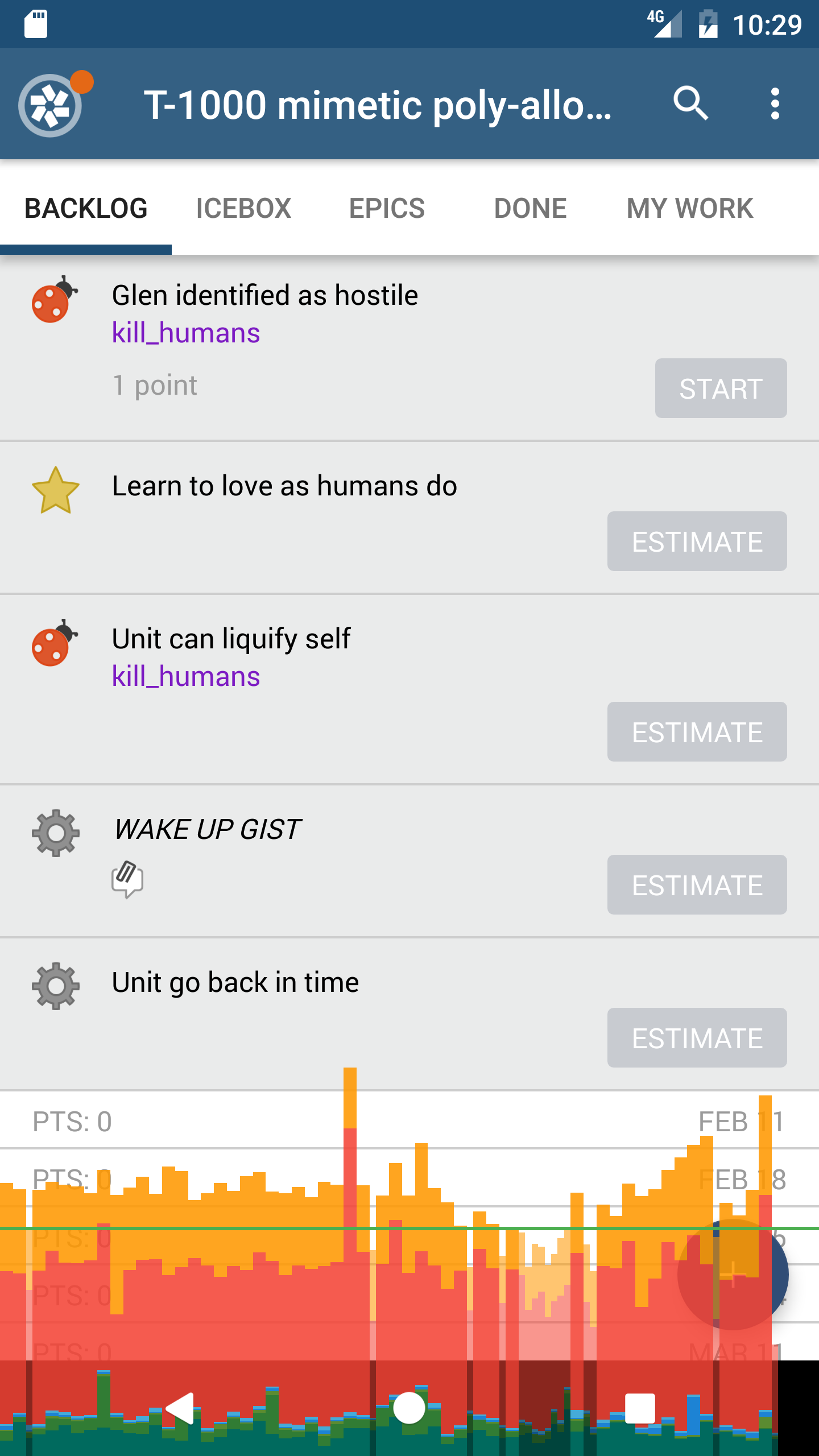
When the Tracker Team noticed jank while using the new and updated Android application, we straight away went looking for something like Chrome’s Timeline tool. For Android, that tool is Systrace. We also used Android’s native Profile GPU Rendering feature to get a more in-depth picture of the bottlenecks in our app’s rendering pipeline.
This guide is intended as an addition to the official Google documentation, Analyzing UI Performance with Systrace, and the page that describes Systrace; we wrote it because those pages offer good technical detail and answer a few specific questions, but aren’t organized well and don’t address the general usage of the tool.
Before viewing the results of your trace, let’s understand what we’re aiming for when we’re profiling.
Google has produced a few videos that give a great overview of this topic. The series of videos that is pertinent to this discussion starts with “Android Performance Patterns: Rendering Performance 101,” and ends with “Android Performance Patterns: Overdraw, Cliprect, QuickReject.”
Here is the golden rule for display performance:
Displays render at 60 frames per second; there are 1000ms per second, which gives us 1000ms/60fps. Therefore we have 16.66ms to render each frame.
Keep this metric in mind as you profile your app. Frames that take longer than 16ms to render will produce visual stutter.
The easiest way to understand the rendering performance of your app is to use Android’s built-in Profile GPU Rendering tool. Google has written documentation covering how to get it up and running, along with some basic instructions on how to use it.
Once you get the profiler running, open your application. The graph at the bottom of your screen will slide to the left as new frames are rendered. The Y axis of the graph represents the render time of each frame. The horizontal green bar at the bottom of the graph represents the 16ms threshold. Frames that take longer than 16ms to render will be slightly wider. If your app has multiple frames above the green line, it has entered the Danger Zone and will look janky.

The graph includes many different colors. Take a look at Google’s handy guide to understand what each of these mean.
Play around with your app. Do some expensive operations. Note when the graphs rise above the green line. Once you’ve found a few places that do expensive rendering operations, take a closer look using systrace.
Just like Chrome’s Timeline tool, systrace captures the operations of your application—using adb and atrace, which uses ftrace—and displays them in a convenient timeline format. You can invoke the tool either through Android Studio or via the command line. I prefer—and this post will cover—the latter because it lends a bit more transparency to any errors you encounter in the process. This guide will use Systrace with Android 4.3 and higher, though the official guide covers using the tool with all versions of Android.
systrace is a python script bundled with the Android SDK and is located in its platform-tools directory. It also requires root access on the device you’re testing on. I recommend using an emulator rather than rooting a physical device.
So, you’ll need:
Once you’ve got those dependencies met, run your application on the emulator.
Because systrace requires root permissions, open up your terminal and restart adb with adb root.
On your local machine, change directories to systrace with cd $ANDROID_HOME/platform-tools/systrace.
Before you start tracing
There are a few interesting configuration options. (For a complete list, see systrace or python systrace.py --help.)
-t <seconds> or --time <seconds> specifies the length of time systrace will trace your application.-o <OUTPUT_FILE_PATH.html> specifies where you’d like the output to be saved (systrace renders output as an HTML document).Once you’ve got all your options figured out, run something like python systrace.py -t 5 ~/Desktop/android_trace_1.html.
Errors you might run into
Running systrace for the first time resulted in more than a few errors for us. The docs say nothing about most of them, so here are the solutions we found:
ImportError: No module named serial
pip, the python package manager. Then install the serial package with pip install pyserial.adb cannot run as root in production builds
systrace against an unrooted device. Start up the Android emulator instead.IOError: Unable to get atrace data. Did you forget adb root?
adb root.-e DEVICE_SERIAL_NUMBER.Viewing the results of your trace
Open the output of systrace in Chrome (it doesn’t open properly in Firefox). The trace file looks pretty intimidating from the outset, so let’s break it down:
Navigation
The tool palette on the right side of the window includes the Event Selector, Pan, Zoom, and Timespan Selector tools.

? at the top right.Select the event selector tool by clicking on it in the floating toolbar, or by pressing 1.
UI Thread (and other threads)
Click on a slice in the UI Thread section. The bottom section of the window will display information about the item you just selected, including its name, timing information, and perhaps documentation. You’ll notice a thin bar displayed at the top of the UI Thread section. This thin bar is separated into selectable pieces:

Running instead will describe which CPU is doing the work. You can click on this description to select the block at the top of the page in the kernel section.Running instead will describe what is running instead of this code.Frames
Click on an F in the Frames section. These Fs represent frame renders. Green Fs mean that a frame has taken less than or equal to 16.6ms to render. Yellow and red means that a frame has taken longer than 16.6ms to render. Selecting a yellow or red frame will describe the problem that caused the long render times.
Press v to highlight VSync boundaries and get a good sense of what 16ms looks like on the graph.
After learning how to use Profile GPU Rendering and systrace, the Tracker Mobile team wielded their powers to squash jank in our new Android application. We found that loading and switching between project panel fragments (i.e., the various lists of stories available under Backlog, Icebox, etc.) caused a significant amount of the jank we saw on the Projects page. This happens because the Project panel loads many stories, each of which has its own views.
After investigating a few options (e.g., flattening the view hierarchy), we decided that the quickest and easiest way to reduce jank was to cache the Project panel fragments displayed in the Project panel list (i.e., Backlog, Icebox, Epics, Done, and My Work).
It turns out that when asked to switch from the first to the last tab in its list, the default behavior of a ViewPager is to render all intermediate views along the way. Rendering four (complex!) panels instead of one is a great way to cause jank, but it’s a necessary effect for the ViewPager because it creates fluidity and the perception of persistence in the application.
Rather than rerendering every panel in between, we cached the Project panel fragments with viewPager.setOffscreenPageLimit to reduce visual stutter when switching between project panels. The only downside to this caching is a slight (10MB) increase in memory footprint, which we are willing to pay for the performance gains.

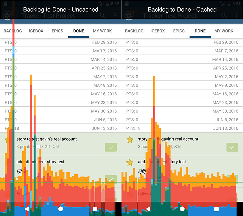
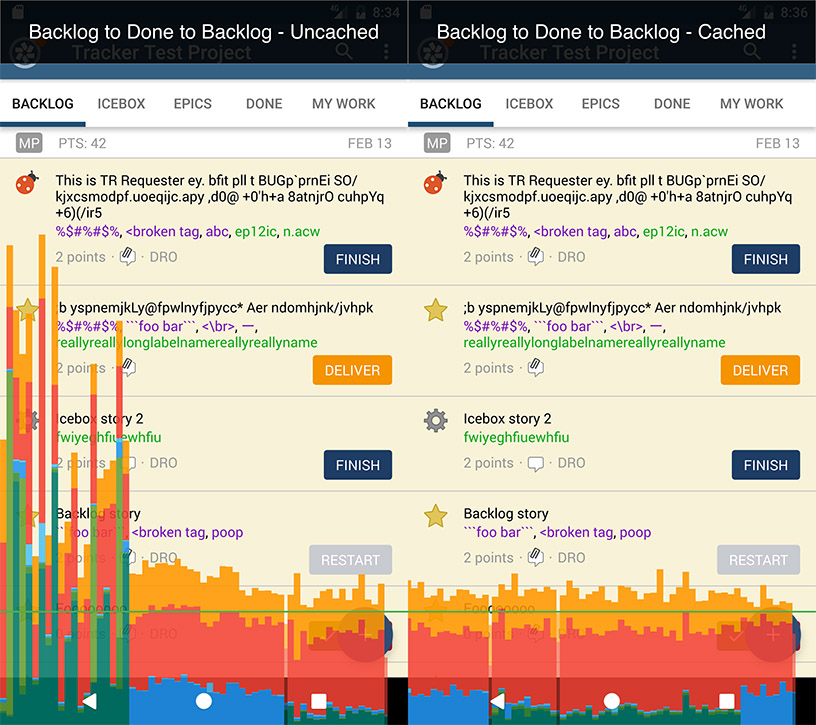
As you can see, caching pages on the ViewPager doesn’t increase the speed of rendering a panel the first time it is visited.

On subsequent renders, though, the rendering speedup is significant. This fix doesn’t address the underlying issues (e.g., complex and nested view hierarchies) that would take a long time to diagnose and treat, but it does offer a great benefit for a small cost.
The rendering profiling tools available on the Android platform are quite complicated. Hopefully this post has made clear the concepts behind rendering performance and some of the undocumented aspects of these tools. If you’d like to see the results of our profiling in a real-world application, be sure to download Pivotal Tracker’s redesigned and rewritten Android Application, and check out out our previous blog post, Re-Engineering the Pivotal Tracker Android App for an overview of the technical considerations that went into building Pivotal Tracker for Android.
Category: Productivity
Tags: Engineering Android