As we move ever closer to coming out of beta with the new Tracker UI, we’ve changed how you navigate Tracker in the header, making it consistent for everyone.

Where’s my cheese?
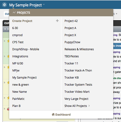
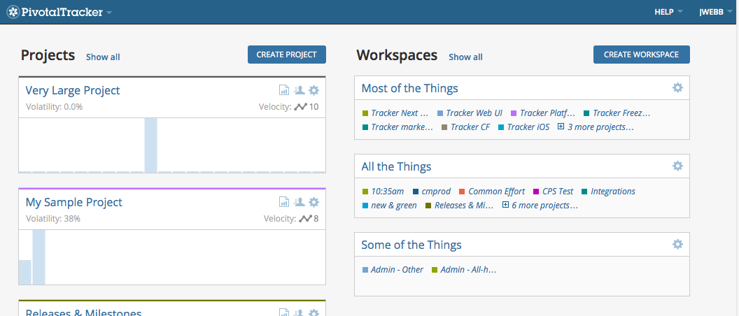
All the items in the header are click-able, and most have dropdowns with more options. For example, click the Tracker logo at the far left, to go to the Dashboard. Click a little further to the right on the project name, to see the Projects list. Also, when you click your username, you’ll see that’s where Reports have moved to.

You can also access the Projects menu in the Dashboard by clicking PivotalTracker in the logo at the top left.
Speaking of the beta, if you haven’t tried it, please do! When you’re in a project, you can switch back to the original Tracker via the option under your username at the top right. Or you can can change between beta and original in your Profile.
Workspaces galore

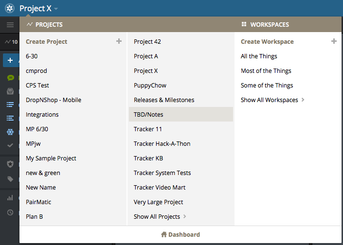
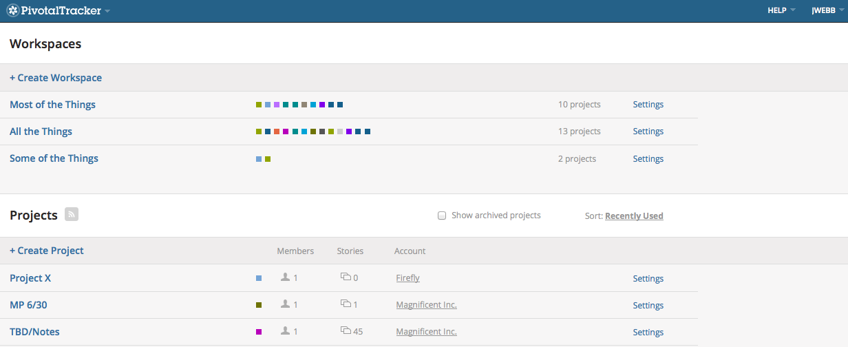
We also heard that many of you wanted more! You asked to be able to have more than one workspace, to help you focus on particular sets of projects. Now you have just that in our latest update.


We hope multiple Workspaces (as well as performance improvements and bug fixes) make the beta a bit better or tempts you to try it! As always, please share your feedback via the in-app feedback button or email, and follow us on Twitter for more.