One of the main reasons people enjoy and stick with Tracker is that at heart, we’re a relatively straightforward to-do app for software teams. By keeping the features you need to get your job done—and only the features you need—at the forefront of the app, we ensure that teams new and old aren’t confused or distracted by the tool that’s there to facilitate the work.
As a result, we’ve taken great pains to be discreet about our nonessential, yet super-nice-to-have features. Tucked away in unobtrusive corners of the app are handy features that we hope will become second nature for you to use. Here are three that will help you get the most out of panels.
1. Split and combine the Current and Backlog panels
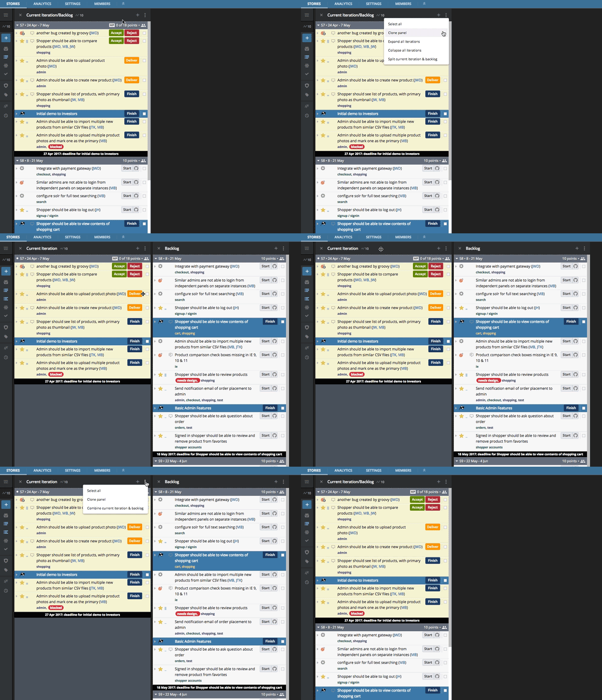
Back in the day, before the My Work and the Epics panels existed, the three default panels in Tracker were Current, Backlog, and Icebox. In our quest to maximize space, we opted to merge Current and Backlog into one column by default. While we saved on space, for some teams we’ve made the week’s priorities a little less clear. By separating these columns, teams can choose to see this week’s iteration in its own standalone column.

Separating and rejoining these panels is simple, once you know how. Click on the three vertical dots (we like to call this the Panel Actions menu) at the top of the Current/Backlog panel and scroll down to the Split current iteration & backlog tab. To reconnect the two panels, do the same from either the Current or Backlog panels and click on Combine current iteration & backlog.
2. Adjust the widths of your panels
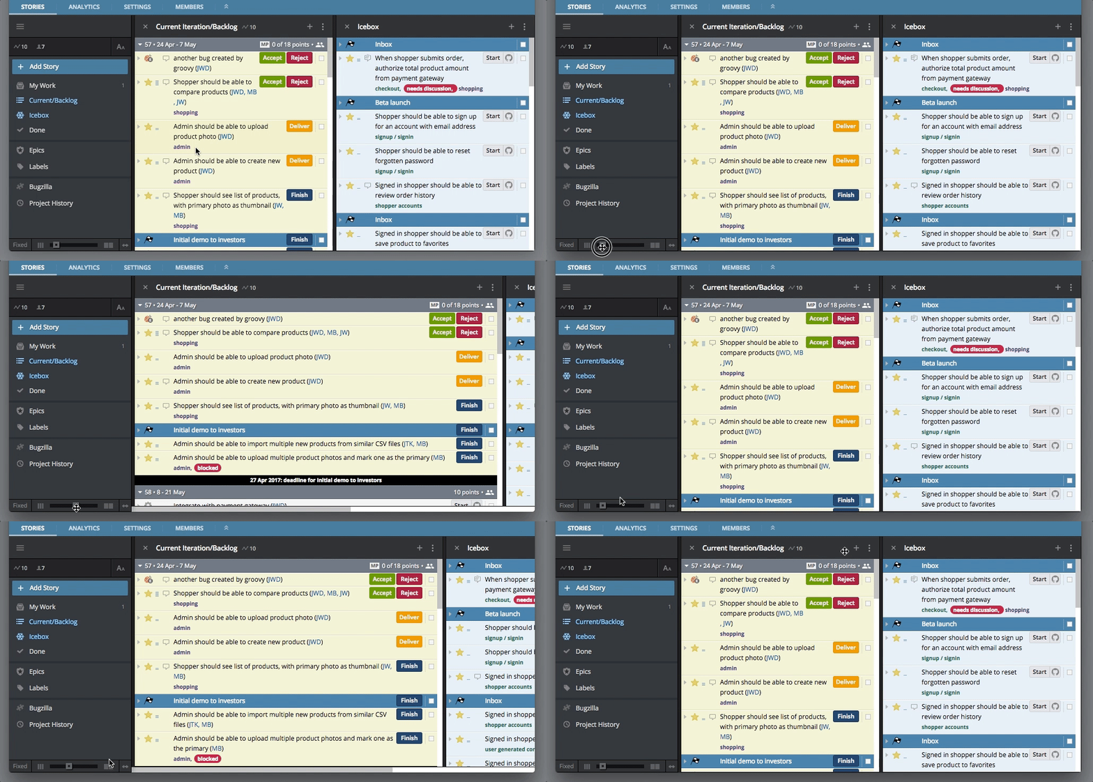
Whether you have one panel open or multiple, it’s nice to have the panels fit your screen properly. At the very bottom of the lefthand menu bar, there is a panel width controller.

Clicking on Fixed will toggle this feature to Auto, which will enable Tracker to automatically size the panels to fit the existing screen. With this feature set to Fixed, the slider gives you the power to control the exact width of your panels. Clicking on the opposing arrows on the far right expands the panels to fit the width of your screen.

Power tip: Double-clicking on the black space in a panel header automatically expands the panels to fill the window.
3. Clone a panel so you can better manage a long list of stories
If you’re responsible for prioritizing stories in your project and you find that you need to scroll down a panel to see the stories you’d like to move up, you can clone the panel to make that easier.
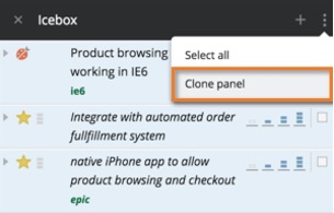
By selecting the clone panel tab from the Panel Actions menu (those three vertical dots again), you will create a mirror image of that panel. This gives you one panel set at the height you desire it to be, while in the second you can scroll to the stories you’re looking for and drag these from your clone onto the original panel.

Once you’re done, simply close out one of the panels. It’s that simple.
We hope this panel refresher will make your Tracker life run a bit more smoothly, and we’ll be covering similar tips in the coming weeks. Suggestions? Questions? Oh, how we’d love to hear them. You can email Support with any feedback, or click the Provide Feedback link under Help in any project.