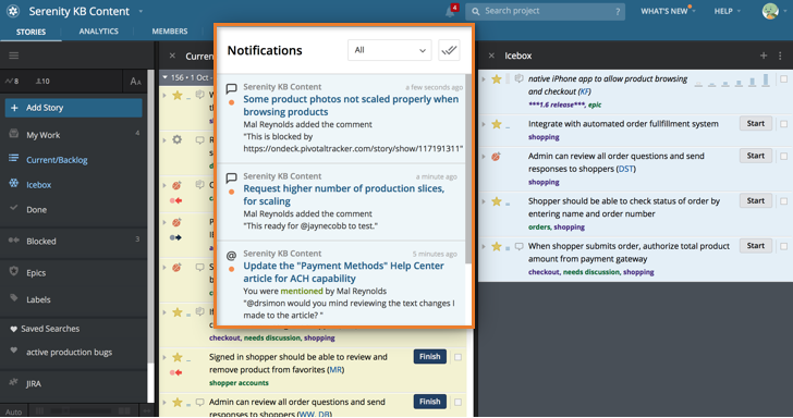
We’ve received quite a bit of feedback from our customers regarding how we can make notifications better serve you—particularly, the in-app notifications.

Based on your suggestions, we’ve made some changes to make the dropdown more readable/scannable and generally more useful. These changes include an overhaul to the look and feel of the dropdown, the ability to filter your notifications, greater contrast between read and unread notifications, and more real estate to view your notifications. Additionally, due to very low usage and little evidence to support its benefit, we removed the separate notifications panel. Read on for more specifics!
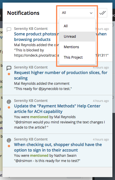
Filtering!
It’s now possible to filter your in-notifications to view unread, @mentions, or just those related to the project or workspace you’re currently viewing.

Per usual, to expand or open the related story, click on its title. If you are in the project a notification is from, it will expand. If the notification was related to a specific comment, that comment will now highlight and scroll into your view! If you are not in the project a notification is from, it will open in a new tab in full-page view.
We want to know what you think!
We really hope that these changes will help you to stay better up-to-date with your notifications! And as ever, we can’t wait to hear your feedback! You can let us know what you think using the Provide Feedback widget under Help in Tracker, via Twitter, or by emailing us.