Last year at a conference, I attended an open spaces session on accessibility and it really caught my attention. Since then, I’ve been taking steps to help our team build an understanding and appreciation for accessibility and the ways that we can improve Tracker with accessibility in mind.

Illustration by Moe Bonneau.
For me, this is the number one reason—we have a responsibility in the tech community to be inclusive and this is one facet of that responsibility. At Pivotal we say: “Do the right thing, do what works, and be kind.” However, if we aren’t accessible, our tool doesn’t work for everyone and we’re not being kind.
Section 508 outlines the U.S. laws for web accessibility, and other nations have their own laws. There have been an increasing number of lawsuits against companies that have not been compliant with accessibility laws.
Accessibility in and of itself is not that hard once you know what to do and how to check for it. It becomes harder when your product is several years old with many features and accessibility hasn’t been a priority (like with Tracker). This situation will feel familiar to many software teams that have grown their software without an awareness of accessibility.
After getting back from the conference, I spent our next team hack day investigating accessibility in Tracker. I found that we were being inaccessible all over the place. I took a look at the page with the VoiceOver screen reader and with the AXE developer plugin.
Here are some of the things I found:
It turns out accessibility has been one of our broken windows for a long time.
One misconception about accessibility is that it’s an on-off switch. Accessibility is actually a combination of many requirements and features that work together to build a coherent experience for all users of the product. It takes a village.
Although getting everyone up to speed is a work in progress, pairing has been a great way to share accessibility knowledge across the team. Pairing with designers, product owners, and testers—as well as developers—has helped carry the conversation about accessibility through our entire process. Having the conversation early and planning accessible ways to interact with new features is how we will do better going forward.
To improve the accessibility experience immediately, we decided to focus our initial work on the Project page (where you can see all your stories). This is where the majority of our features live and where our users spend most of their time. By narrowing our scope to the Project page, we focused our work on the features that make the biggest difference on that page. We started by getting all of our inputs labelled and then then shifted our focus to helping keyboards and screen readers navigate more effectively using focus styles and landmarks. Reaching for the low-hanging fruit on this page made accessibility easier to tackle.
When we write accessibility stories, we focus on one component of the page for one accessibility persona at a time. These are some of the stories we’ve completed:
So far, we’ve made progress towards the following higher level goals:

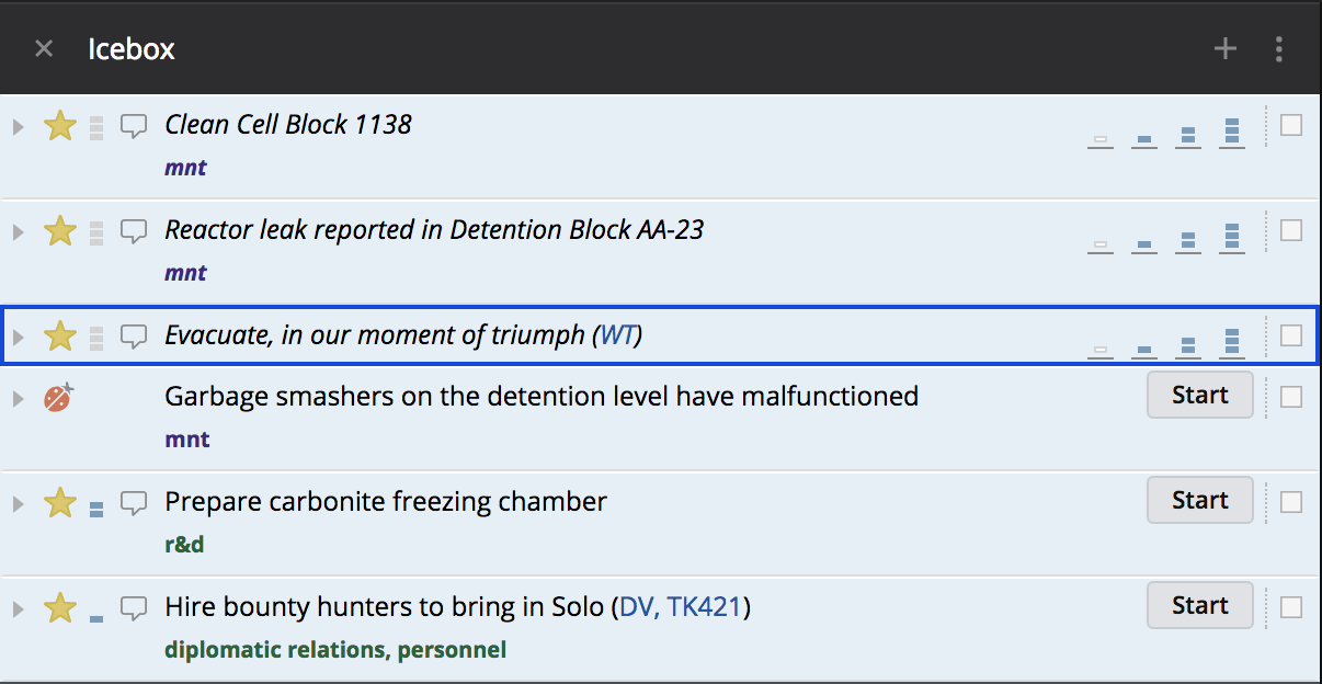
Blue focus ring around a story.

Skipping links in Tracker.

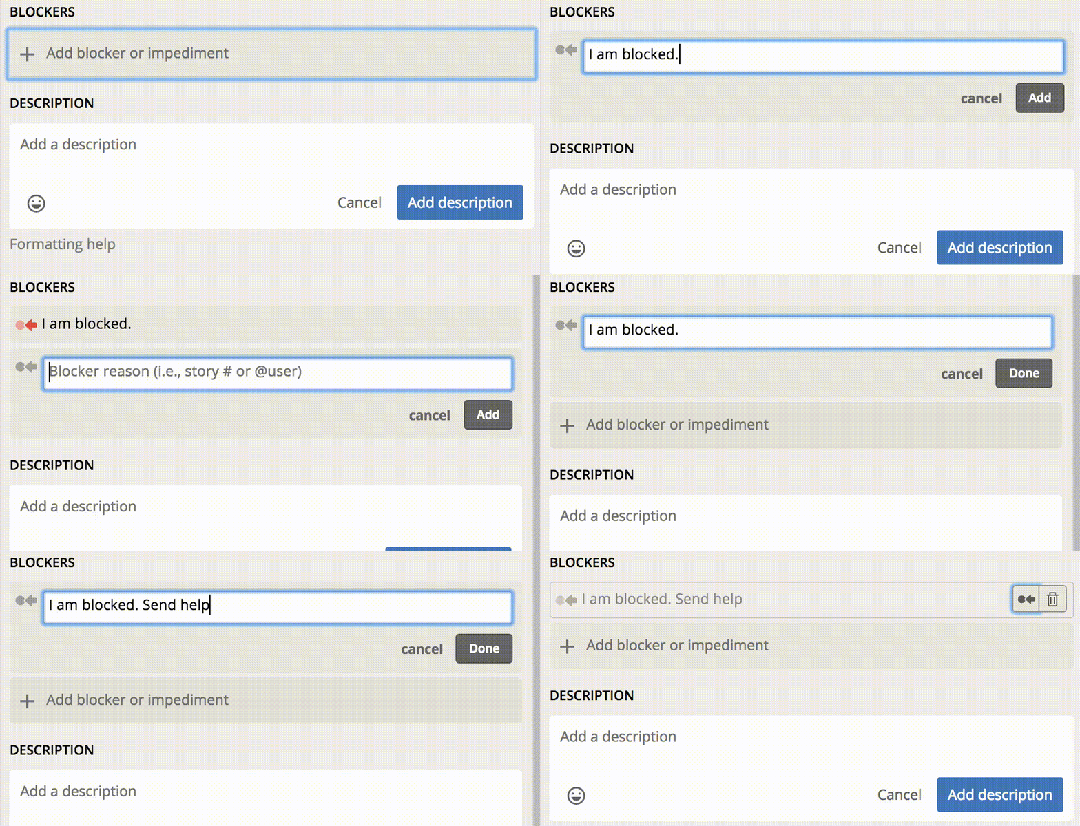
Creating and editing a blocker with keyboard actions.
This is an overview of the steps we’re taking to address accessibility issues in Tracker. By building a shared understanding of where we are and where we want to be, we have been able to start making our product more inclusive. What has your team done to improve accessibility?
Category: Updates
Tags: How to