Now that Analytics are out of beta, you may be thinking, “Shiny! But how does this help me?” We’ll start to answer that by digging into some ways you can use the project Overview page to understand your team’s performance and identify areas for improvement.
Here are some of the most common questions people ask about their project:
All of these questions can be answered on the project Overview page!
Good teams are consistent and predictable, and that allows them to deliver value at a sustainable pace—a core XP tenet. Being predictable lets you more reliably predict when something will be done. Velocity is an important metric, but perhaps even more valuable is the volatility of that measure. Lower volatility means a higher likelihood of completing work and hitting release markers on time. This post from Ken Mayer discusses volatility in much more depth.
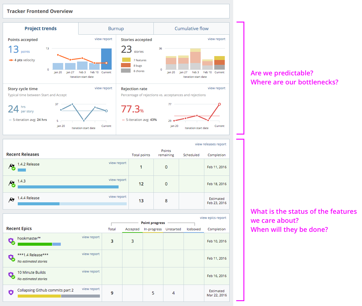
Take a look at your Velocity chart in the top left corner of the Project Trends tab of the Overview page. It shows the velocity of the current and last few iterations, along with the team’s running velocity—that’s the average velocity of the last three iterations (by default). How does it look? Does your team consistently deliver the same number of points? Great! If not, why not? Dramatic changes or trends in your team’s velocity could be an indicator of other problems and might be worth investigating.

Is there a dip in your velocity? Check out the other graphs to see if they indicate any evidence of a cause for that dip. In this example, our running velocity took a downward trend starting from the Jan 20 iteration. In the Story Composition chart, look for bug walls or a glut of chores that could explain the drop in velocity. We did hit a bug wall in the Feb 3 iteration, which coincided with another drop in our running velocity. Cycle time increased in the Jan 27 iteration, so perhaps we should do a little more investigation there, too. Sometimes, an increase in cycle time can be tied to an increase in rejection rates. Is that what happened here? Looking at the rejection rate chart, we see that our team had a lower-than-average rejection rate that iteration, so there doesn’t seem to be a correlation. This means we should look for other reasons that the cycle time was higher that iteration.
Identifying changes in velocity and diagnosing the reason for those changes is a great way to home in on issues in your team’s process and find areas for improvement to keep you delivering consistently and predictably.
From speaking with our users, we learned that two of the most common questions that people have to answer about projects are, “What are you working on?” and “When can I have it?” In other words, what product features are in progress and how close are they to completion? Features are usually represented as epics in Tracker, and the Recent Epics section of the project Overview can help you answer those questions. Here you can see which epics were completed in the last two iterations and the status of epics that are in progress. The progress bars allow users to quickly visualize how much work has been completed, is in progress, and is unstarted for each epic. Estimated completion dates are calculated based on estimated stories in the Backlog, which will help answer the question, “When will I get my new toys?”
Additionally, the Recent Releases section can help you keep track of what work has just gone out and what’s coming up next. Any releases completed in the last two iterations will appear here, as well as the next Release and its estimated completion date.
We hope that’s enough to help you start answering questions and getting the most from our new Analytics. In our next post, we’ll look at how customer project managers helped us improve them.
As always, we welcome your thoughts and suggestions. Please use the Send us feedback link in the upper left corner of Analytics to submit your comments, or email us.
Category: Productivity
Tags: Analytics